Sunday, 29 January 2012
Fashion Show research
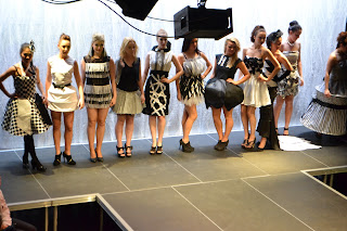
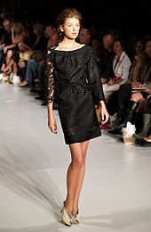
These are different examples of fashion show photography. I have chosen these for my research because they have been photographed in ways that you can see the outfits without anything in the way.
This may be difficult for the fashion show I am shooting, as we have to be careful where we stand so we don't obstruct other things that are going on. There will be lots of place to photograph the fashion show, some mainly being at the sides on the ground floor, and at the sides from above.
Editing for final image
First of all I changed the levels on the image.
Next I copied the converse sign that I got off google.
I then pasted the converse symbol onto the main image.
I then clicked 'multiply' which took away the white background of the converse symbol.
Next I increased the size of the symbol by using the 'free transform'
I finally moved the logo into the right hand corner of the image.
My images.
I took all these photo's in black and white because I like the way they looked.
In these photos I was changing angles and positions of the shoes.
For my final image I am going to use a picture of just the badge because I think it's a good focus for an advert.
Research
I chose this image for my research because it is very different to the other to. The badge for converse is the main focus of the advert. Even though this is the case, I like the way the shoes have been put into the image to make it less boring.
If the badge was on it's own then it wouldn't really draw attention it, and people would think it is boring.
People need things to stand out so that they will remember them.
If the badge was on it's own then it wouldn't really draw attention it, and people would think it is boring.
People need things to stand out so that they will remember them.
Advertisement research
For my advertisement I am looking at using converse, so for my research I am going to look at converse advertisements.
These are two very different styles of converse, and I like the way for the plain converse on the bottom image, the background is more wacky. And on the first image the background is plain because of how colourful the shoes are.
I like they way they keep the adverts bright and colourful, because then they will stand out better to the viewer who is looking at the advert.
I also like the way you can see the whole show on both images, but I am going to look into just the logo, so I'm just advertising the name 'converse' so people will look for it, then see other types of shoe.
Final magazine cover.
I chose this image for my magazine cover because it is a studio shot, and is a close up which most magazine shots tend to be.
On the build up to this final piece I wasn't sure about using the blue on the font, but it stands out against the photograph in the background more than other colours do. Also there is blue in the image on the dress.
I have included all the main features of a magazine, the title, the main heading (vintage returns), side headings, barcode and date.
Wednesday, 25 January 2012
My development for magazine cover
To start with I added the title for the magazine, I decided to use the font 'georgia'. I thought this looked the best and stood out well in white, because of the colours in the image. If I had used a dark colour it wouldn't have stood out well and you probably wouldn't have been able to read it properly.
I made the font big so that it stands out because it's the title and overpowers the other writing that will be going on the front cover.
This was the next step, I added a barcode and a price, then started looking at different things to put on the cover. I used these colours because I thought they stood out but I don['t think they go with the rest of the cover and the colours on the photography.
I then decided to play around with different fonts and colours to see if it made an improvement to the cover. I chose the blue because of the blue on the dress. I think this colour is too dark so I am looking at brighter colours that will fit with the cover.
Tuesday, 24 January 2012
I have chosen these images for my research because they are both fashion magazines and I aiming to make one like this for my final magazine cover. I like how these are close up images, and they are like the one that I have chosen to use.
These have both given me ideas, from where to place writing and where to put barcodes and different sized writing.
Wednesday, 11 January 2012
Magazine Covers Research
I found this image on http://www.magforum.com/cover_secrets.htm
I am using it for my research because it shows a good break down of everything on the front of a magazine. This will help me with my final idea because it shows me what I can put on a magazine cover and what works well.
Subscribe to:
Comments (Atom)


